THE
BRIEF
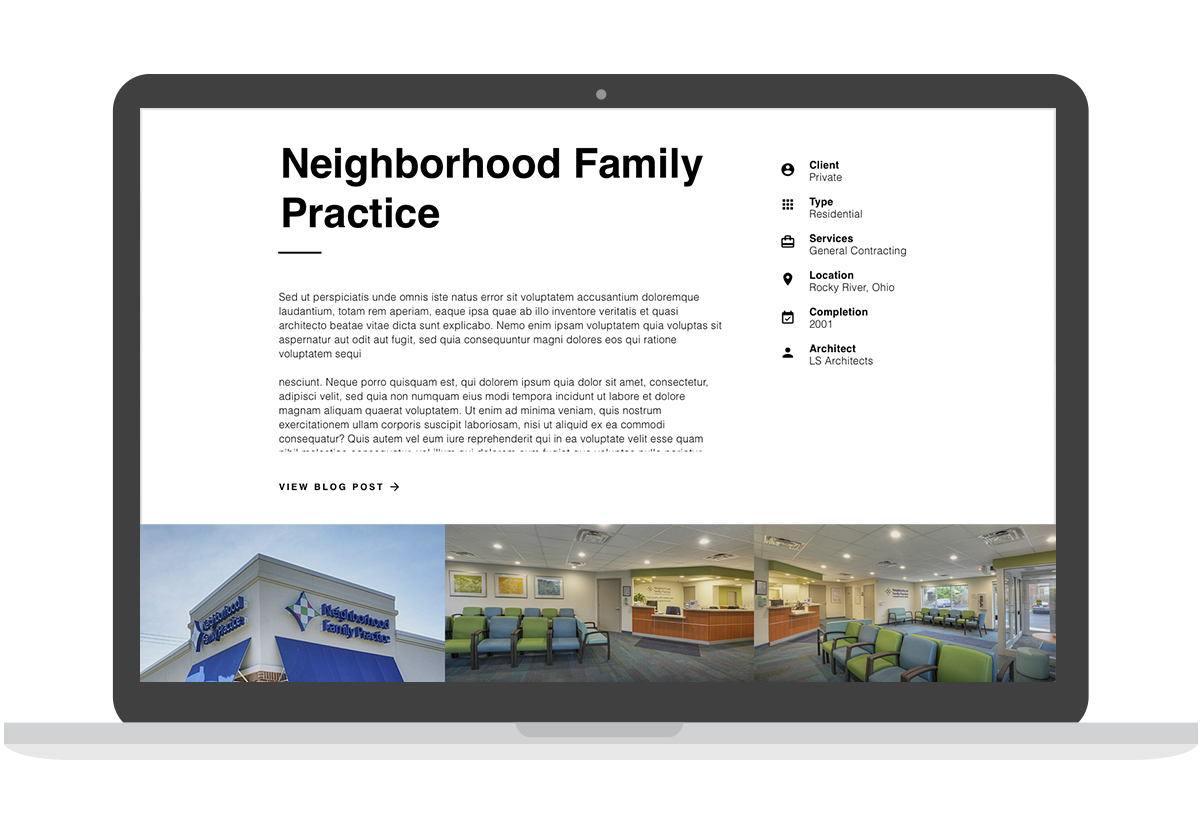
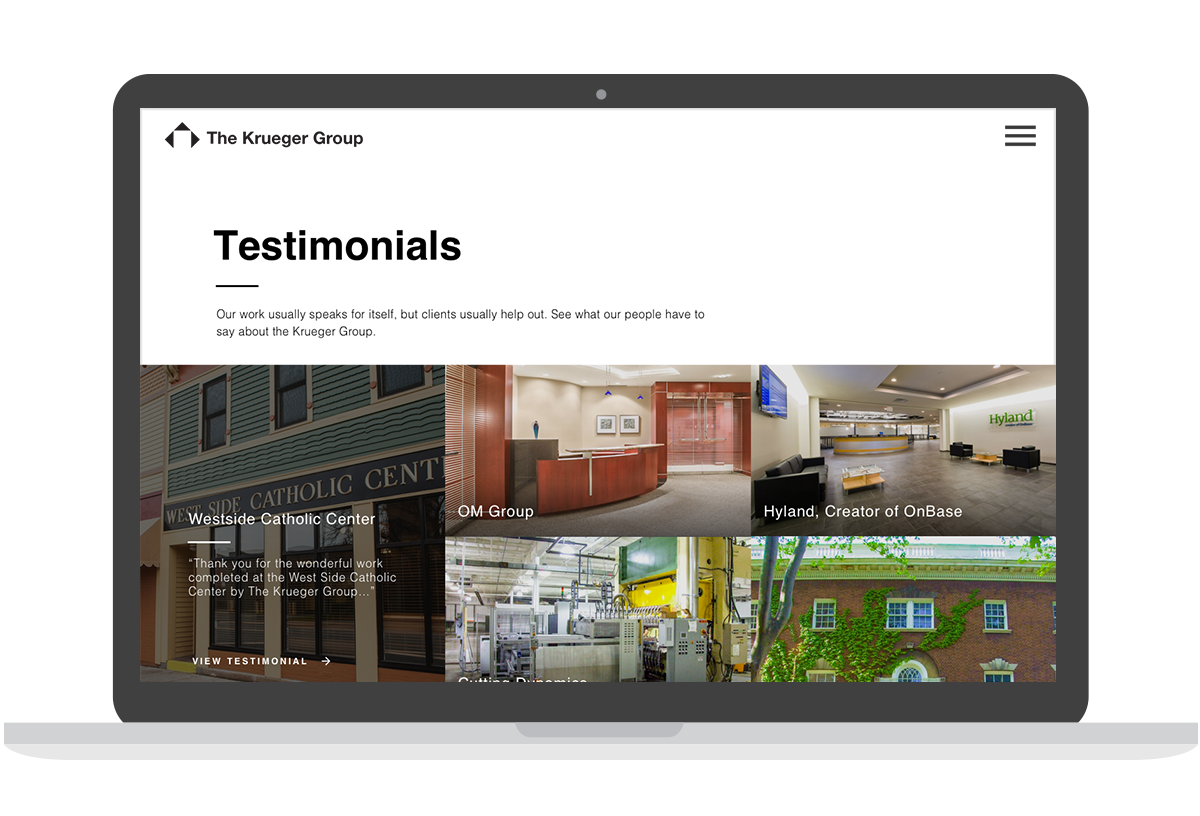
The Krueger Group was in need of a marketing website to promote their construction and development projects. They wanted visuals that closely held hands with their brand identity and relay a sophisticated look. The site is to be fully functional and easily navigated by the user, which, in turn, creates lead generation for the sales team.
SERVICES PROVIDED
Web Design
UX/UI Design

THE APPROACH
Identifying the User: I developed 2 personas that best described the users of the website. These personas helped us to understand the logic and demographic of the site visitors. The users needed to be able to easily browse projects and find an area to contact the team for more information.
Wireframes + Sitemaps: I created user flows and mapped the journey of the average user. I created preliminary wireframes using Figma focusing on structure and experience.
High fidelity designs: High-fidelity designs were created using Sketch. Design systems were created and implemented into a usable style guide. Regular design reviews were coordinated with the development team to make sure that certain interface appearances and experiences were feasible.
THE SOLUTION
Created a marketing website through UX process of wireframing, prototyping, design, and execution. The overall aesthetic is clean and sleek, cohesive with the branding. The site features smooth transition animations that add a little extra flare to the design.


