THE
BRIEF
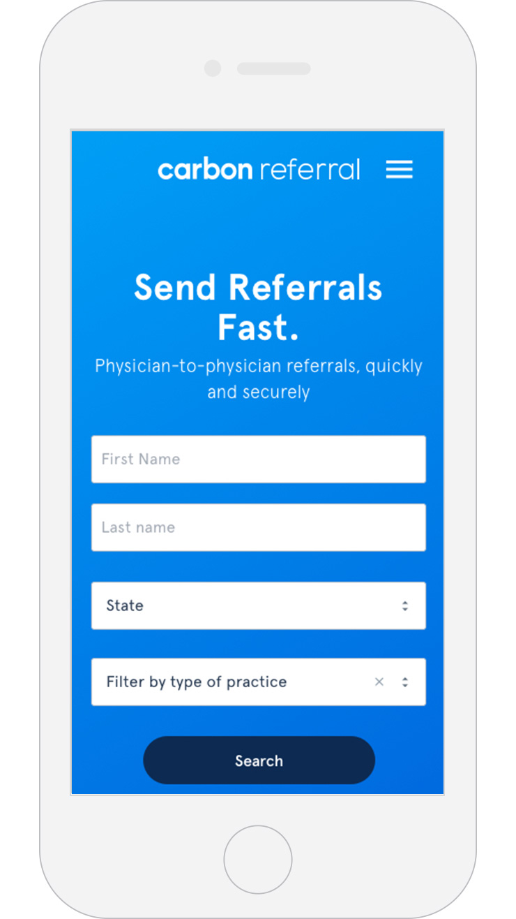
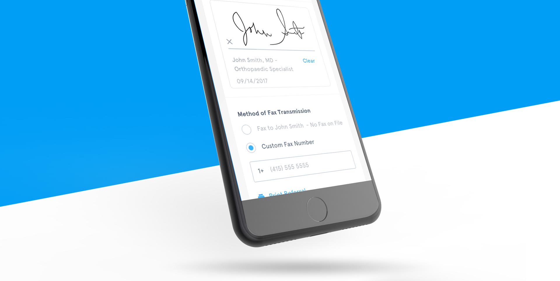
Carbon Health combines smart technology with clinics to offer a uniquely seamless experience with virtual and in-person appointments. Within the Carbon Health network, physicians often were required to refer patients to specialists. The process for physician referrals was to fill out a form and fax to network providers per HIPAA compliance. This process was time consuming for doctors when they needed this time to meet appointments and fill out online medical records.
SERVICES PROVIDED
Web App
UI/UX Mobile Design
THE
APPROACH
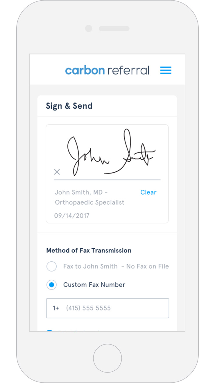
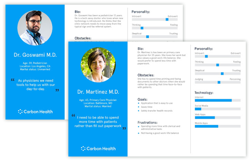
Identifying the User: Paired with the Carbon Health product team, PM and I created user interview questions to identify all the physician pain-points. These questions ranged in topics from ease of use, navigation, and accessibility. Using the month-long timeframe of the survey from internal and external test users, I developed 4 personas that best described the users of the product.Although these 4 users had work and/or personality traits that are specifically related to that person. All users needed an experience that was easy to use and has a seamless referral system that allows for HIPAA compliant signatures, and secure transfer of the referral. Carbon Health needed a streamlined application to eliminate the need for physically faxing referrals.
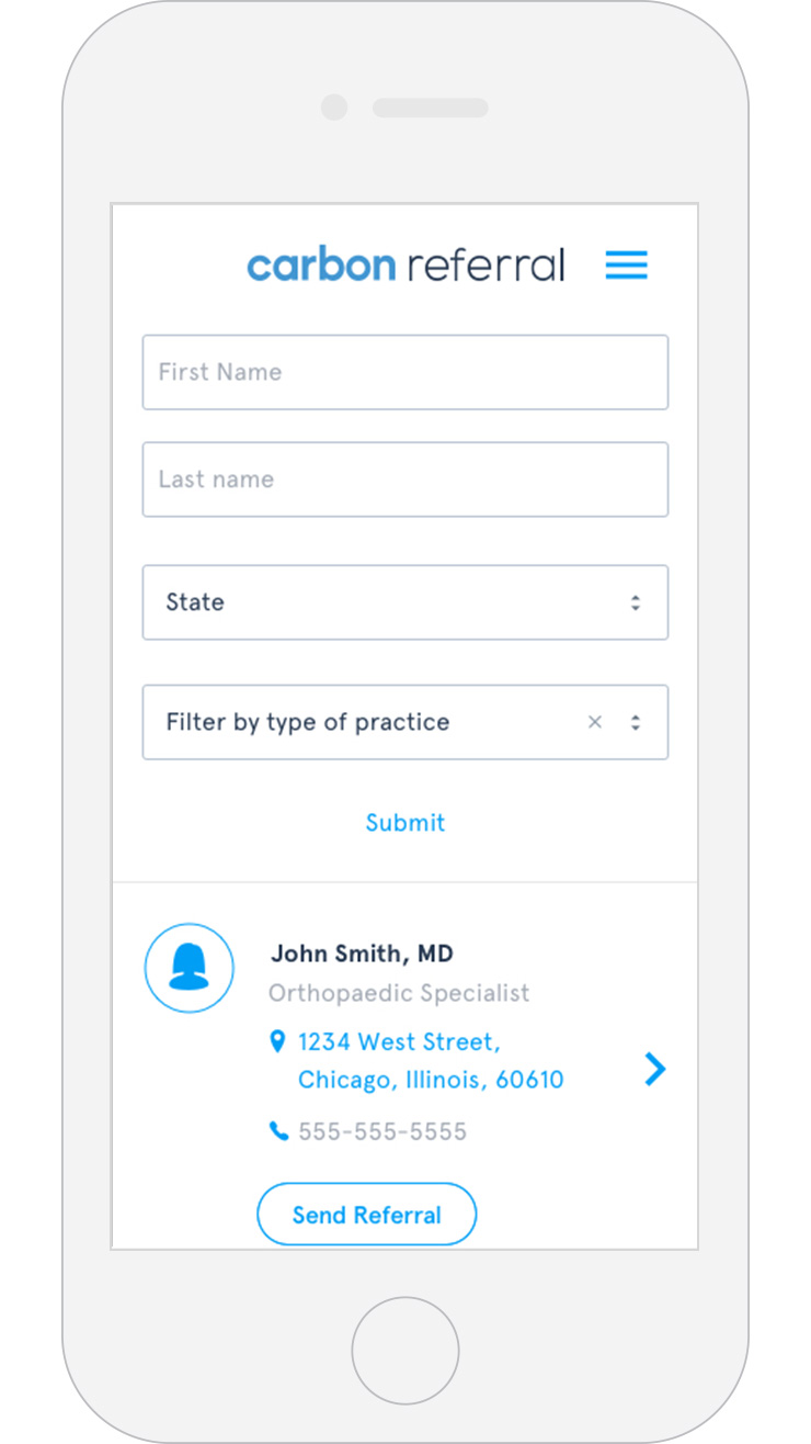
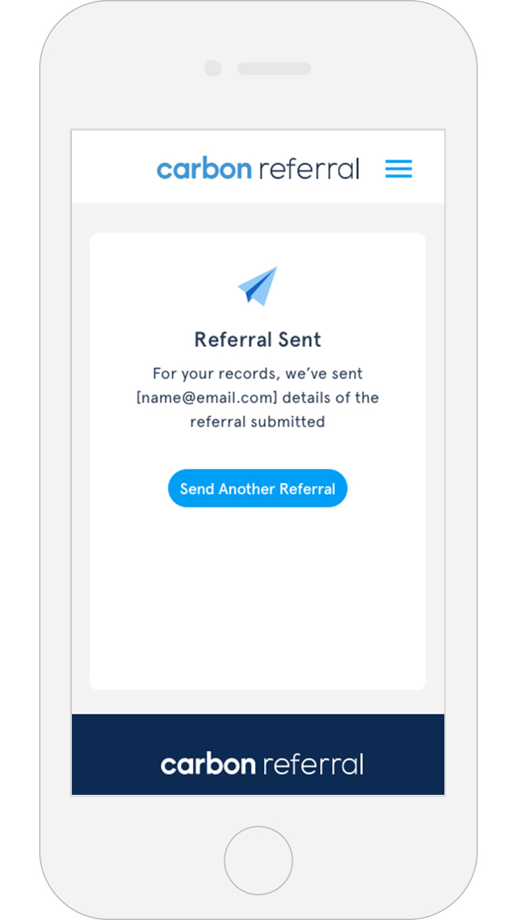
Decision Making: A group of internal stakeholders from management, engineering, and design met to analyze the must-haves for the experience. We decided we needed an app that would be easy to use and allow users to enter patient/doctor-to-doctor information, review, sign, and securely send the referral through an automatic faxing system. Not only implementing a seamless flow, we needed to look into how to send these referrals within the HIPAA compliance guidelines. Our developers and team researched what it would take to be a HIPAA business associate and adhere to privacy laws regarding data transfer and decided on using Aptible as 3rd-party app.
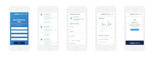
Wireframe + Prototype: I created preliminary wireframes and site maps and held meetings with stakeholders and the design team to review the process After the wires were solidified, I designed a low-fed prototype focusing on structure and experience. The Prototype was implemented through InVision.
Validation: The low-fidelity prototype was given to 8 physicians. The testing was observed using a participant platform called Userlytics. After the users navigated the prototype, the users were asked to complete a series of user experience tasks via the Userlytics platform. The data from the tasks and answers were used as a foundation of the next step.
High Fidelity Design: The high-fidelity design and components within Sketch were transformed into a usable style guide within Zeplin. There were regularly conducted design reviews with development and the Product Manager to make sure that features were prioritized. Builds were broken into 2-week sprints.

THE
SOLUTION
The product was beta launched within select clinical networks. During this time we received positive feedback from physicians on the ease of the product and the convenience of being able to easily send the referrals without having to print and fax within a few steps. The physicians also mentioned that they felt secure that patient information was being safely transmitted with the Aptible platform. The UI of the product received praise as the physicians remarked that the app was clean, modern, and coherent.

