THE
BRIEF
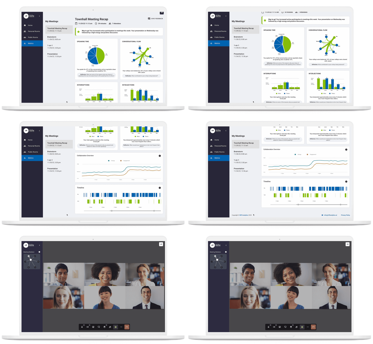
Riff uses voice data obtained from video calls to show how people interact in order to help people develop situational awareness in real-time and adjust their behaviors accordingly. They were in need of a way to showcase these metrics as a proper platform for the user to comprehend the data given to them. The current product featured the metric findings in a series of graphs and charts that were not valuable to the average user and users had to multi-click to find and attend meetings.
SERVICES PROVIDED
App Design
UX/UI Design

THE APPROACH
Identifying the User: Our team identified user pain-points. The focus was on ease of use, navigation, understanding the metrics given, and accessibility. 3 personas were developed that best described the users of the product. Although the user backgrounds varied, they all needed an experience that allowed them to easily read the metrics given to them and to utilize them to strengthen the way they communicate, learn and perform.
Decision Making: The initial meeting included a small group of internal stakeholders from the Riff engineering, and marketing teams. We decided we needed to create a product that is not only easy to navigate, but presents only the most pertinent information. I sketched out what the product should achieve and what actions should happen and we reviewed them in our reviews. Our conclusion was to offer only the most important information and provide the information to them in the simplest way and the users should be able to easily create/join/edit meeting rooms with ease.
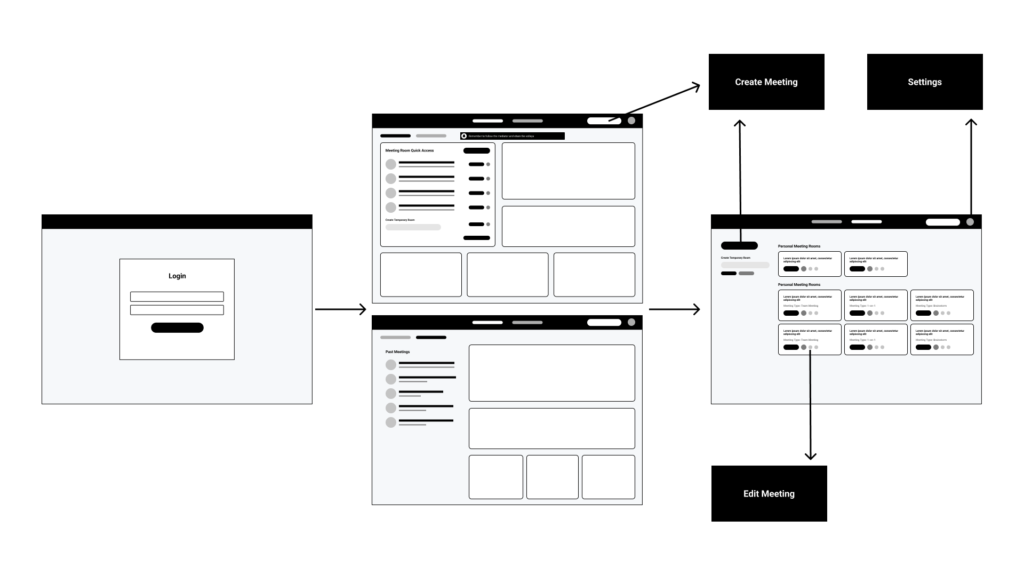
Wireframe + Prototype: I worked through user flows and mapped the journey of the average user. I created preliminary wireframes using Figma focusing on structure and experience
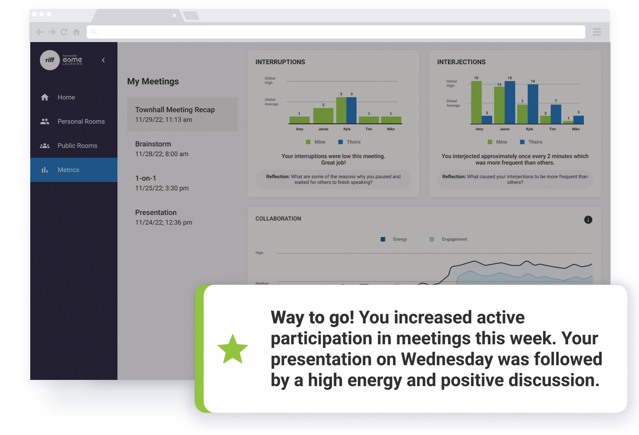
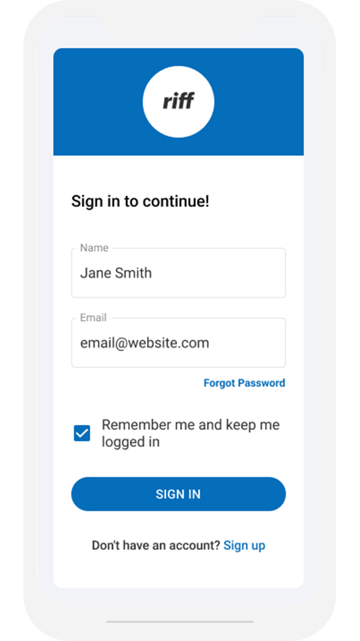
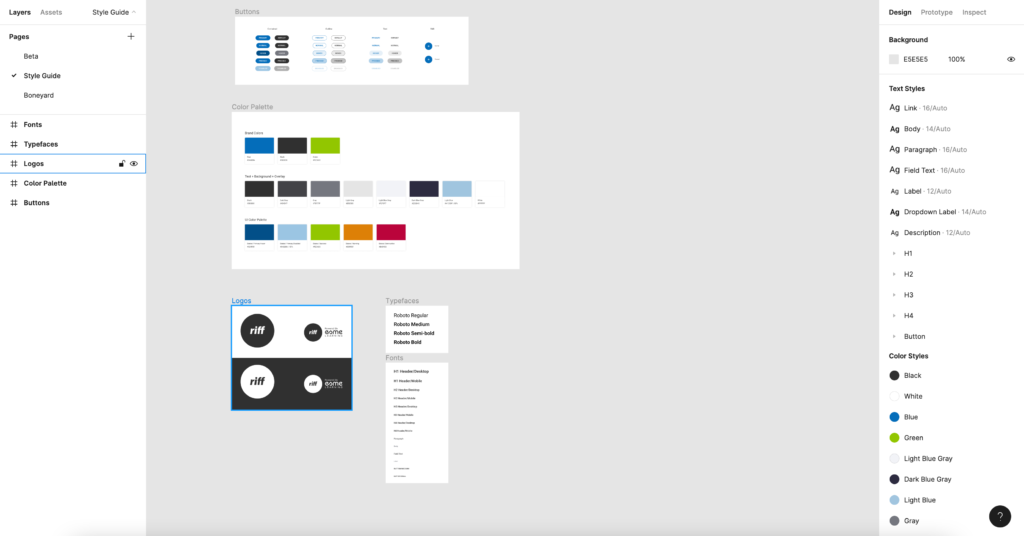
High Fidelity Design: I created a high-fidelity design using Figma. The design systems and components were created to maintain style structure. Regular design reviews verified certain functionality were feasible to execute. These designs considered the user and displayed the metrics in a useful way. I unburied the meeting access and made the interface to edit/create more intuitive.
Validation: The beta app was built using high-fidelity designs and was given to internal users. After the users navigated the beta site, the users were asked to complete a series of user experience tasks via the validation platform. Results from the soft launch were overall positive and users said that they were able to take the feedback from the data and use it to guide future video conversations. Any requests for revisions were taken into consideration and were used for edits.
THE SOLUTION
A well-designed collaboration platform was created presenting useful metrics that provide personalized feedback about their conversation dynamics in real-time. Users were able to read the metric information given to them in a relatable tone, which in turn, increased group performance.
