THE
BRIEF
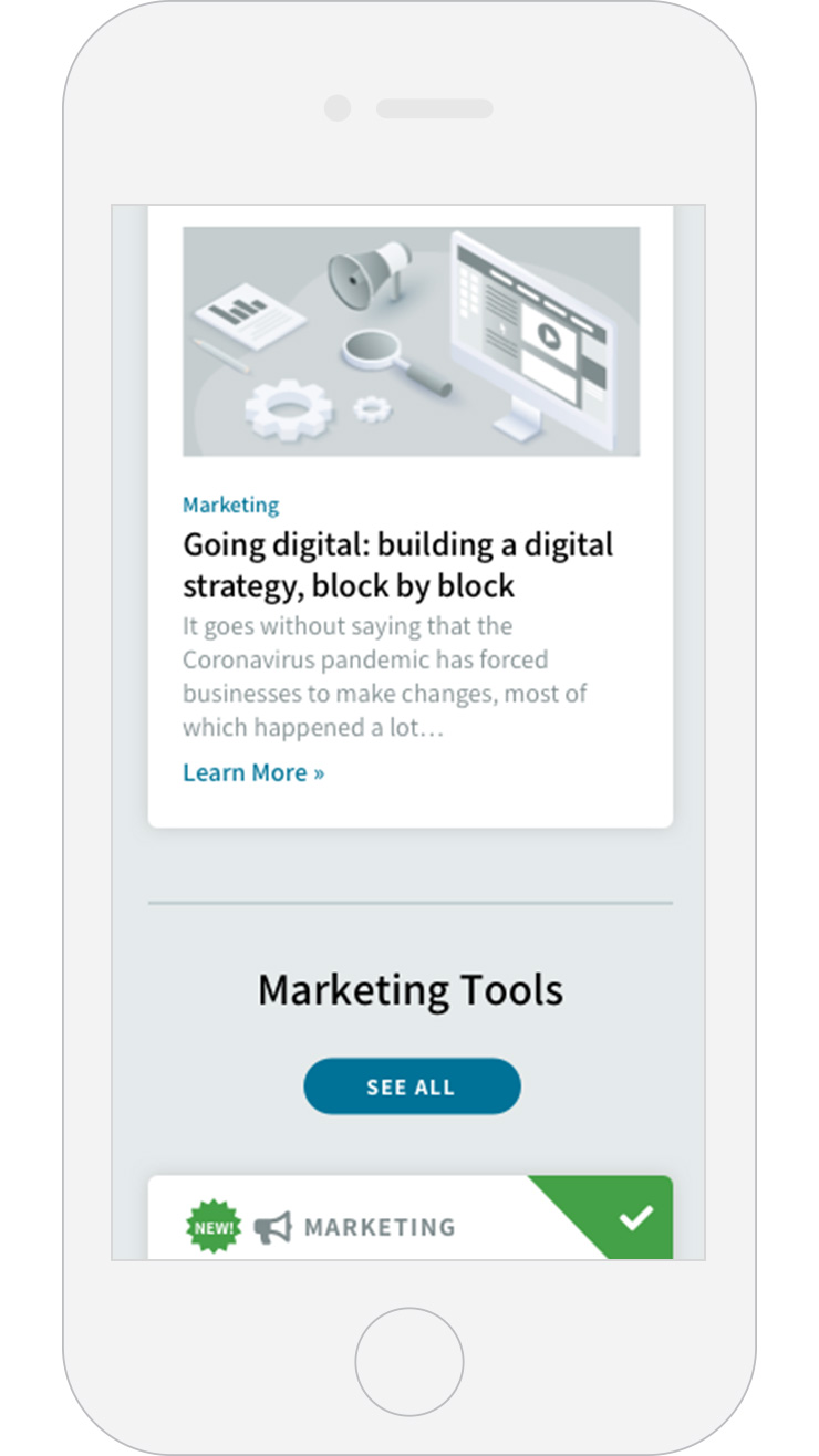
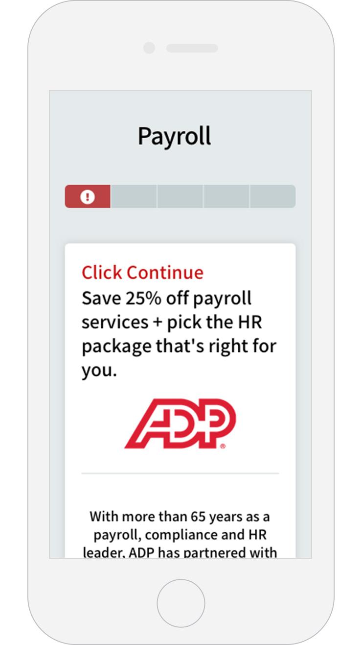
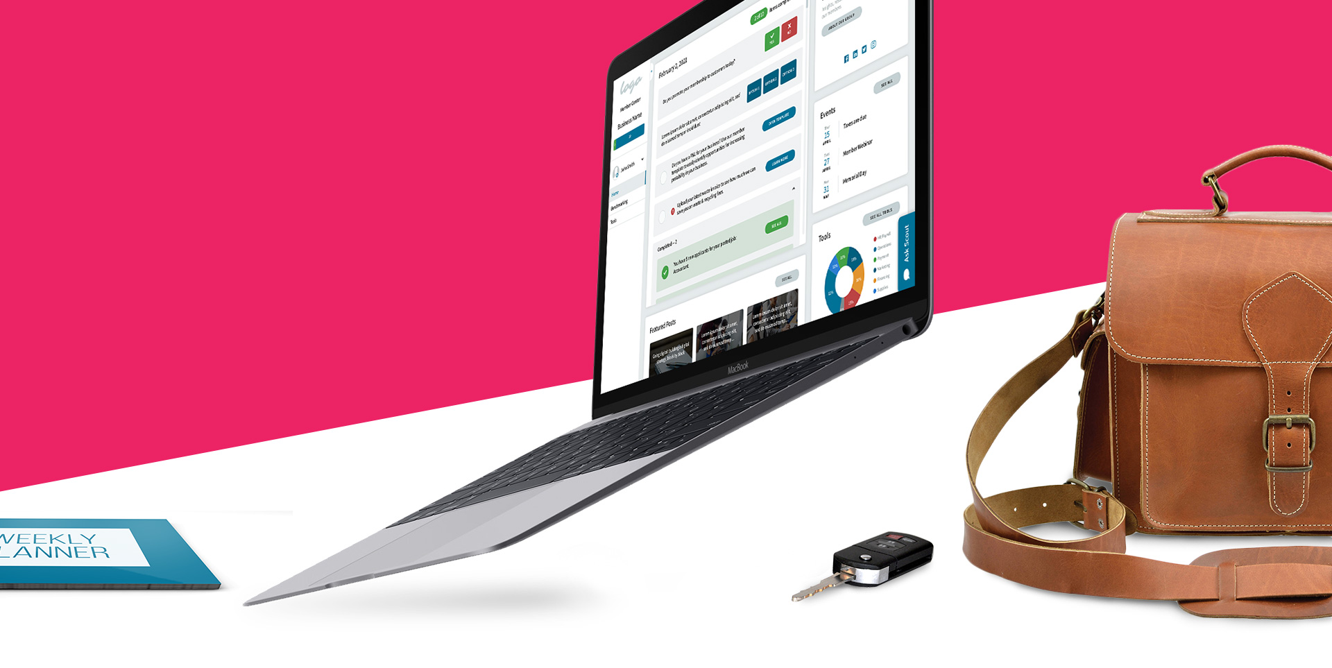
Organizations were in need of a centralized hub where their members could have access to free business resources and tools to help their business grow as a membership perk. Prior to the My Member Center platform, the SaaS product offered was clunky and did not allow for self-service sign up. For the vendors that required forms or additional information, the member was required to contact customer service to have them complete the transaction. This resulted in many incomplete sign ups. Organizations were paying into a service that they weren’t getting substantial rebates for.
SERVICES PROVIDED
App Design
UX/UI Design
Branding
THE APPROACH
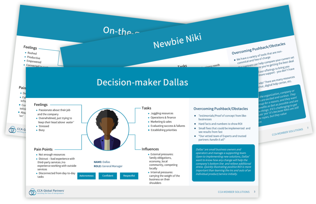
Identifying the User: Our team created a user survey to identify member pain-points. These questions ranged in topics from ease of use, navigation, and accessibility. Using the month-long timeframe of the survey from internal and external test users, our team developed 8 personas that best described the users of the product. Although these 8 users had work and/or personality traits that are specifically related to that person, they all led to this solution… they needed an experience that saved time and was easy to utilize.
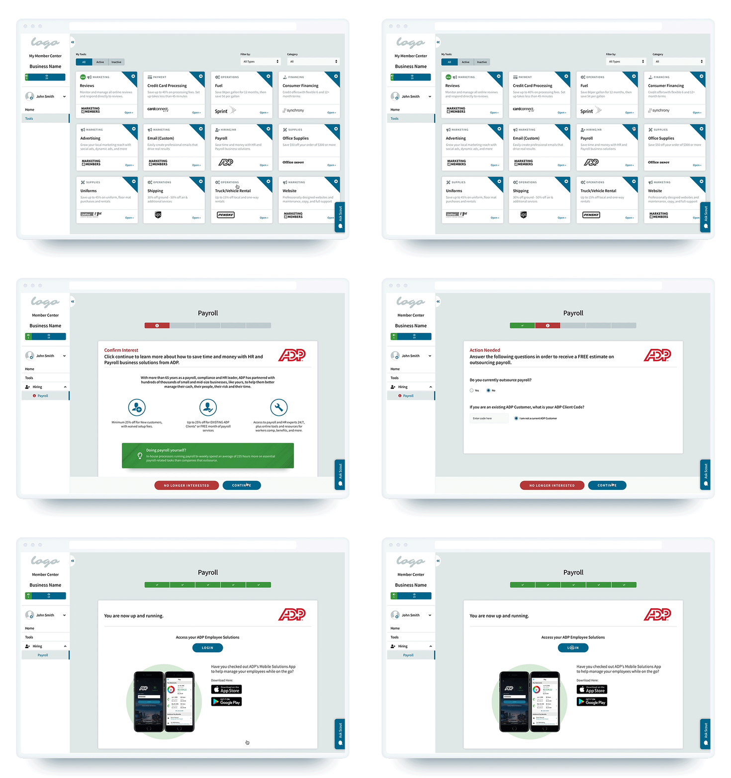
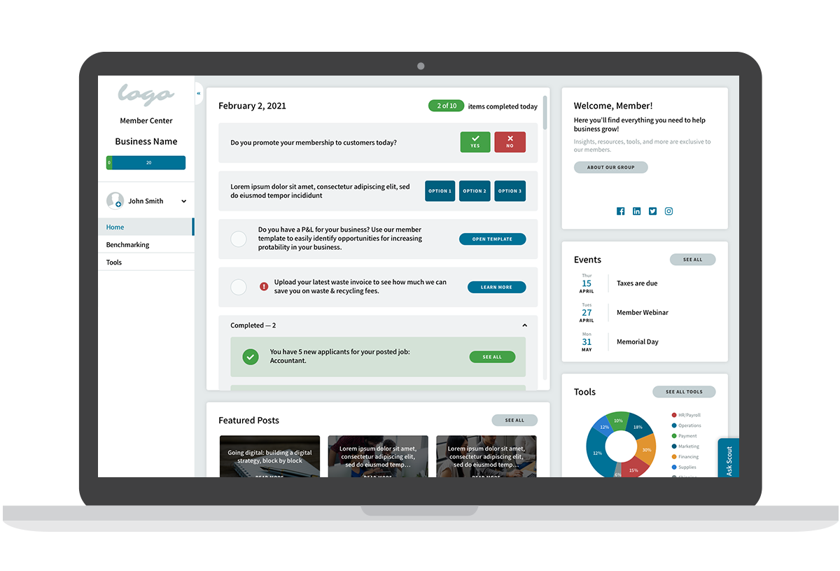
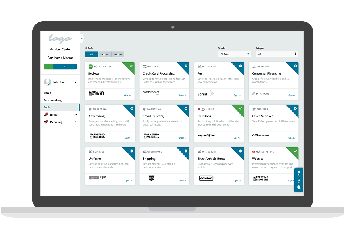
Decision Making: During the decision-making session, we included a small group of internal stakeholders from the engineering, design, and marketing teams. We decided we needed a product that would be easy to navigate and allow members to access business tools with as little of a process as possible. A dashboard was needed for orgs to show customized content and stats for the individual member. In this meeting we sketched out what the product should achieve and what actions should happen. One-click activation of business tools was the best solution.
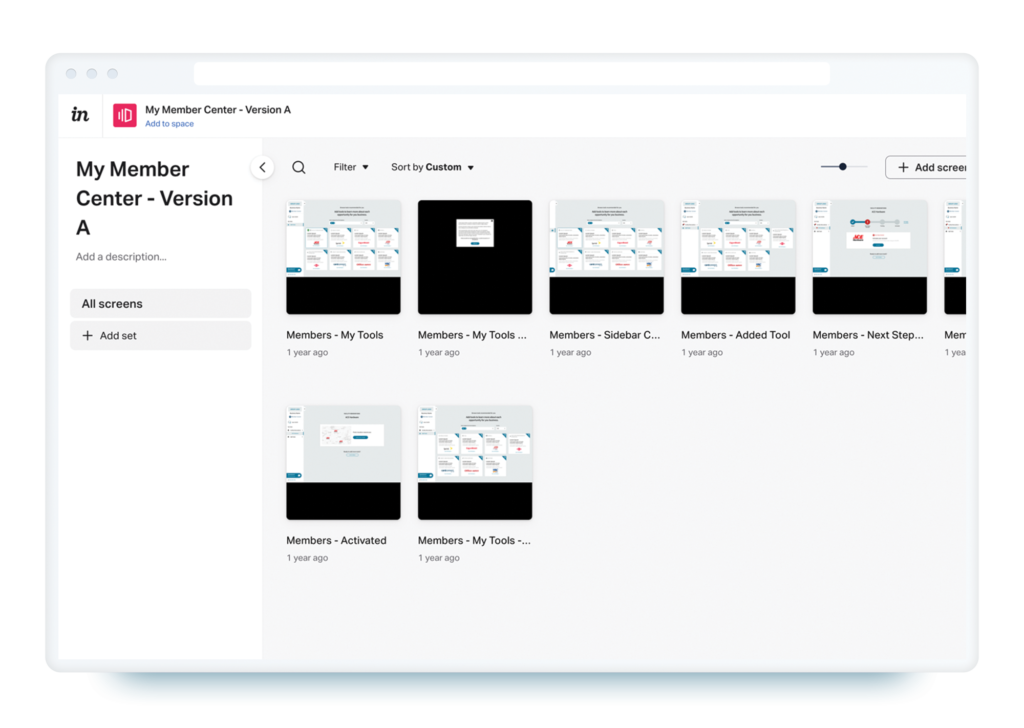
Wireframe + Prototype: PM and I worked through user flows together and mapped the journey out. I created a preliminary wireframes and prototype focusing on structure and experience. Wires were designed using Sketch and prototype through InVision.
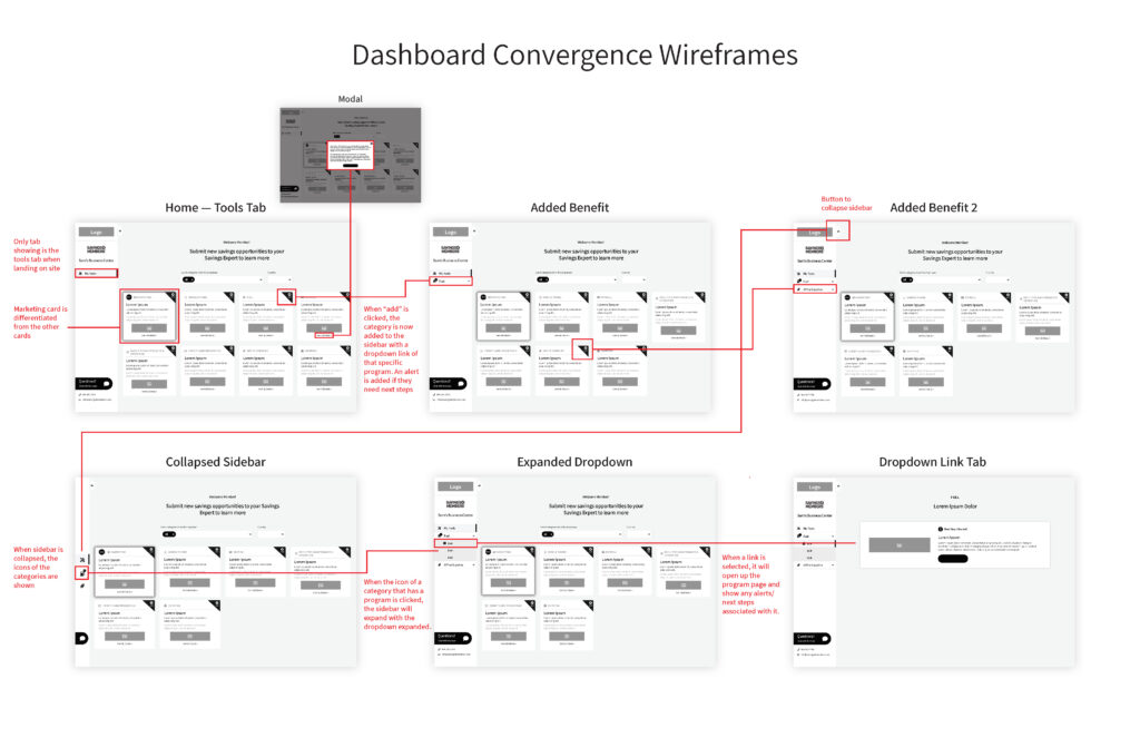
Validation: During the testing process, the prototype was given to external users. After the users navigated the prototype, the users were asked to complete a series of user experience tasks via the validation platform. The data from the tasks and answers were used as a foundation of the next step.
High Fidelity Design: I created a high-fidelity design using Figma. The components and design were transformed into a usable style guide within Zeplin. There were conducted design reviews with development to make sure that certain interface appearances were feasible. After the database was finalized by the engineering team, regularly conducted design reviews with development and the Product Manager to make sure that features were prioritized. Builds were broken into 2-week sprints using the Agile SCRUM methodology.
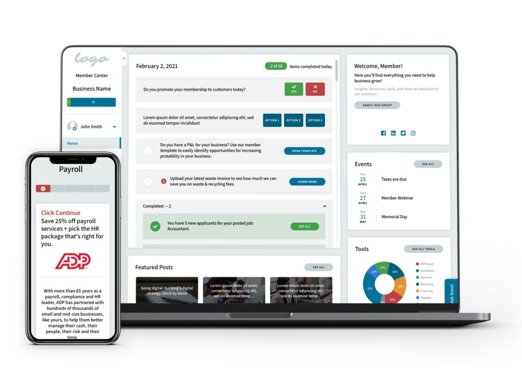
THE SOLUTION
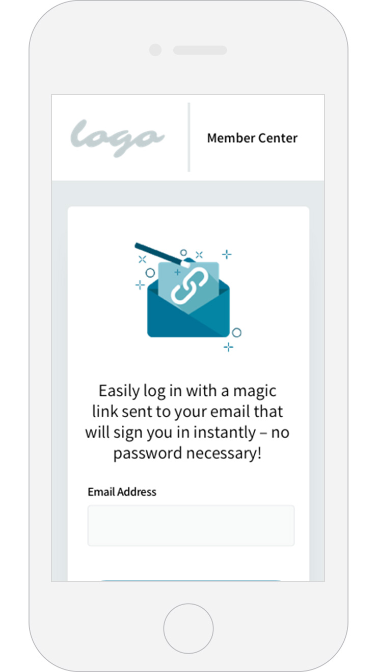
The product was beta launched to the first set of initial organizations. During this time we received positive feedback from members on the simplicity of the product and the ease of signing up for business tools. Soon after, business tool sign-up doubled. The organizations were thrilled about being able to supply their own content to members on the main dashboard. Like any other product, there is always room for iteration and improvement. The experience evolved to simply the process further.
